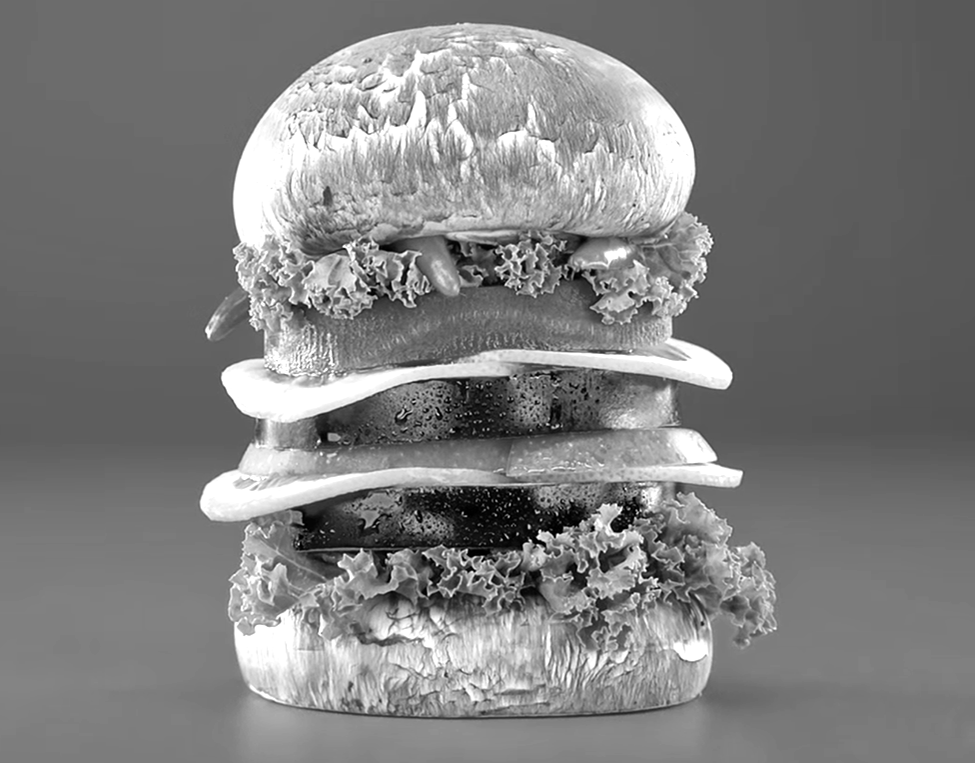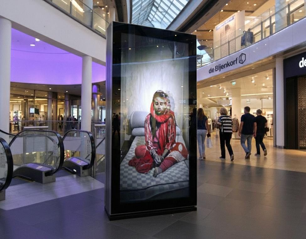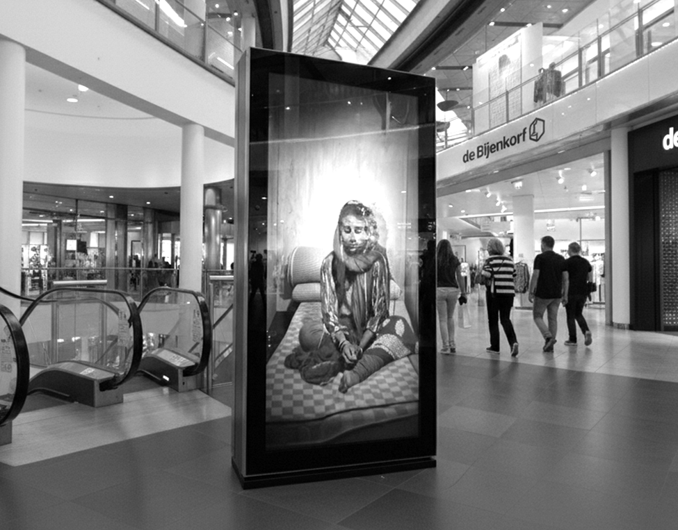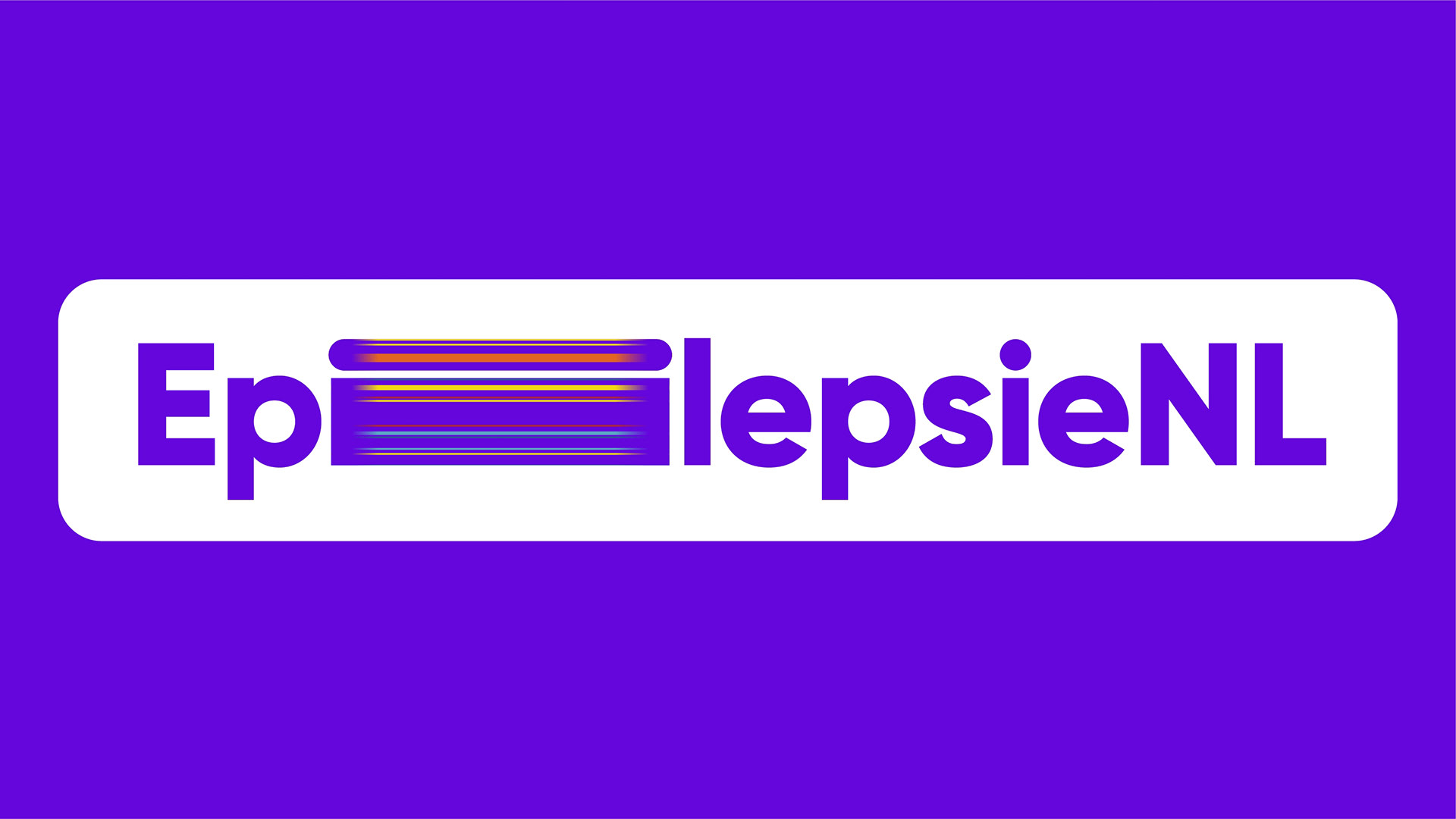
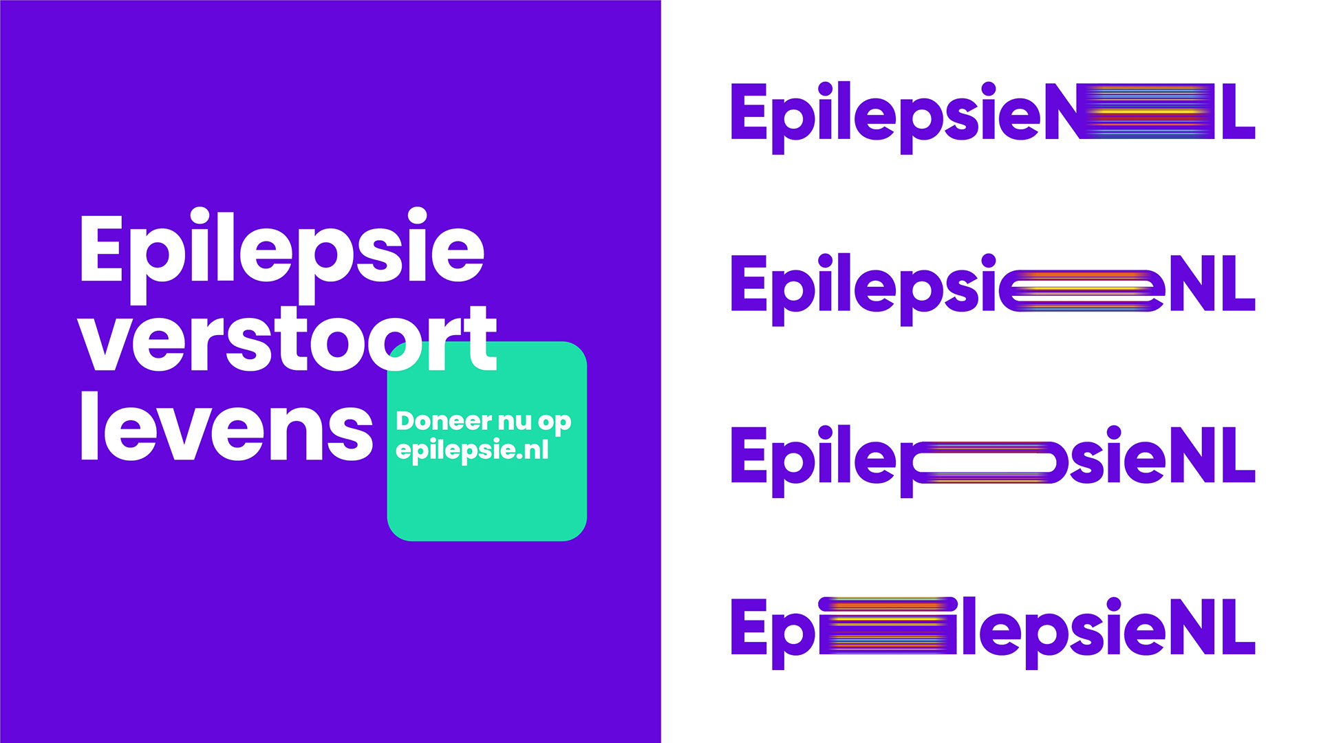
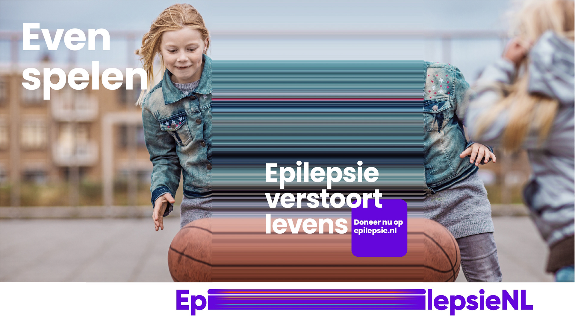
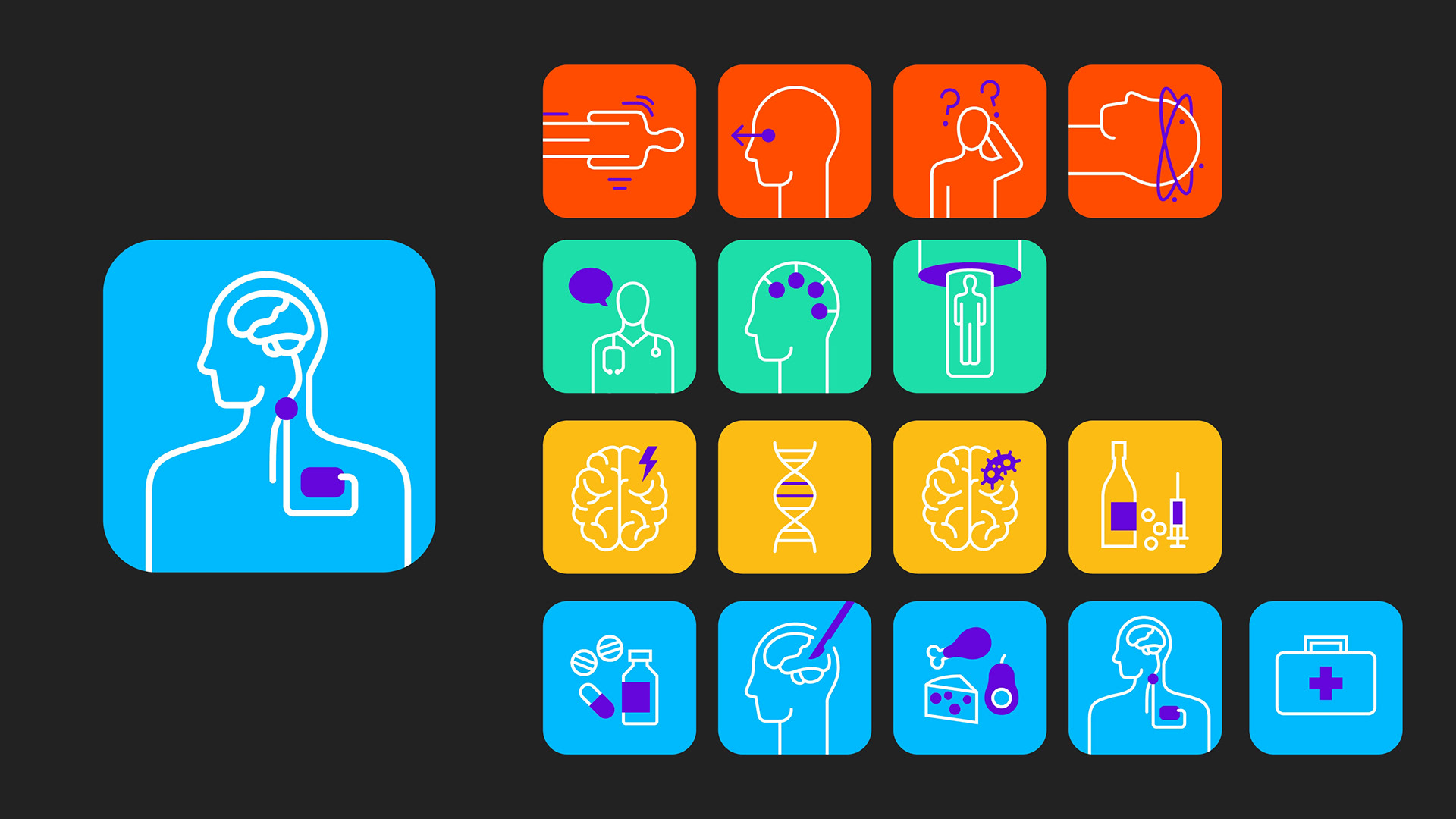
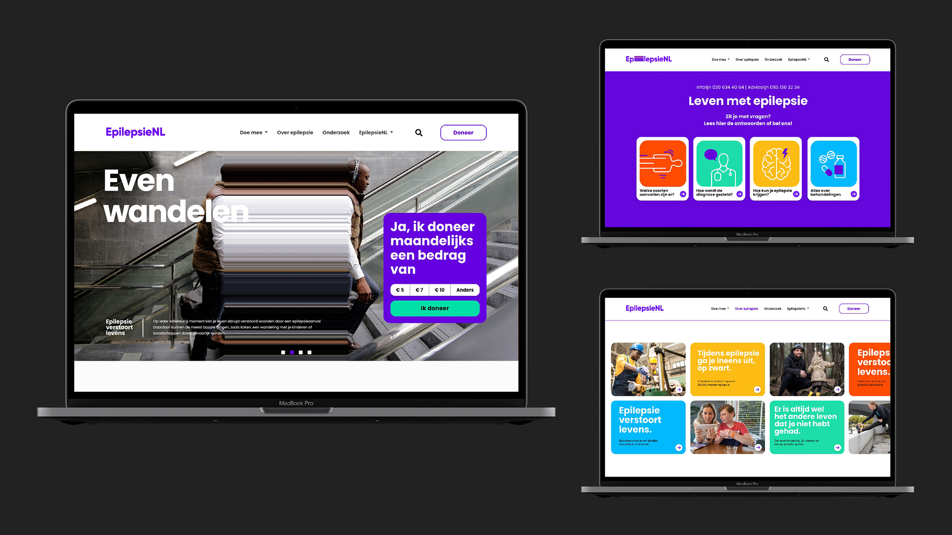
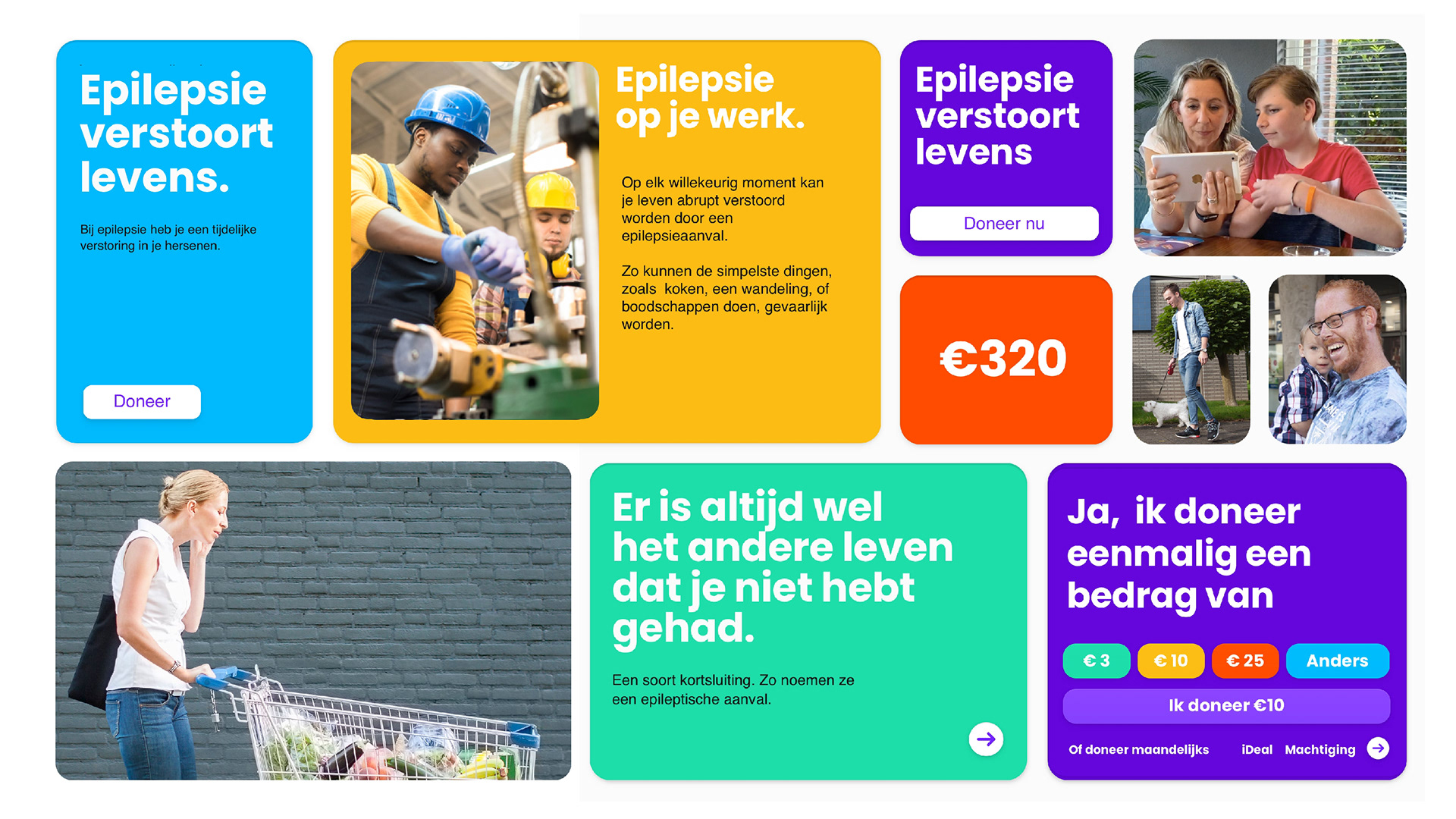
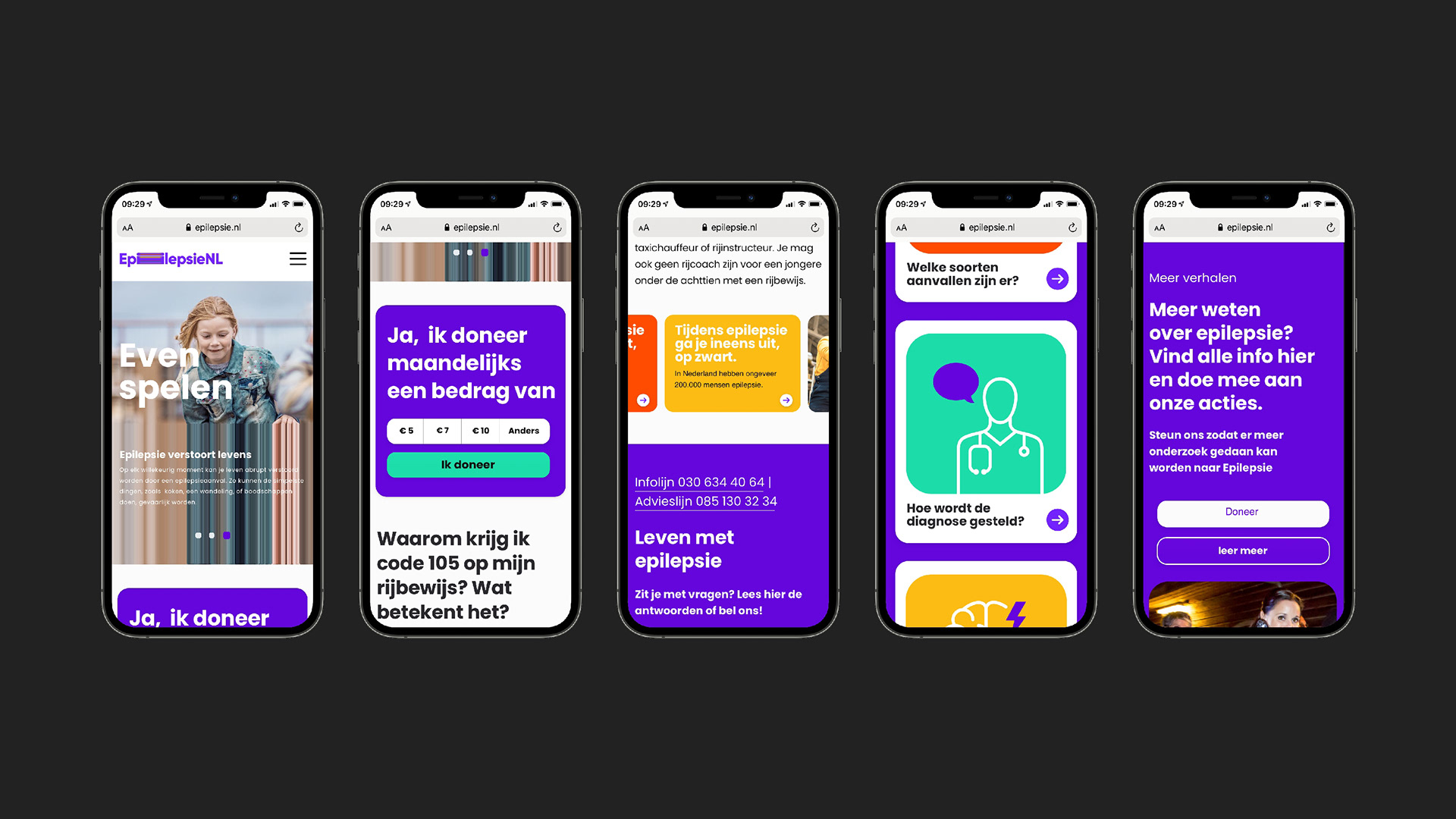
We made the new branding and marketing style for EpilepsieNL. The basis is a stretch effect that disrupts the logo and images used in advertising, etc. The stretch visualizes the disruption an epilepsy attack enacts on the person. The unique graphic imagery does its work everywhere. And even without images, the logo shows exactly what the impact of epilepsy is. The primary color of the style is a lavender purple, which is the color of International Epilepsy Day, because of lavender’s positive effect on people with epilepsy. Each element contributes to the message: epilepsy disrupts lives.